INTERVIEW PROJECT
WHAT COMPANY?
RICH MNISI.
WHO ARE THEY?
They are a Men's and Women's Contemporary brand catering to an aspirational market. The company is young at heart and explores the world of modern culture and heritage while also focusing and putting an emphasis on African art and culture.

WHERE ARE THEY LOCATED?

WHY DID I SELECT THIS COMPANY?
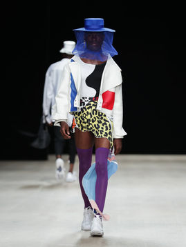
I wanted to find a company that created unisex clothing or a brand that created pieces that were not specified for any particular gender. This brand definitely does not gender articles of clothing, which I really liked. I also really liked the collection that they put out in 2019.
HOW LONG HAS THE COMPANY BEEN ESTABLISHED FOR?
The company was founded in 2015 by Africa Fashion International Young Designer of the Year 2014, Rich Mnisi.
The company is located in South Africa.
WHAT WERE SOME OF THE KEY TRENDS THE COMPANY PUT OUT IN 2019 / AT THE BEGINNING OF 2020?
For their 2019 collection, they worked with primary and secondary colors. White was the base for almost all of their pieces, in which they incorporated the other colors to make the pieces bold and pop. Their products also effectively used lines in order to create movement in their clothes. Texture was also an important element used that can be seen in some of their pieces and also their hats.
At the beginning of 2020, they also worked with color in a way to make them stand out in their pieces. The palette is a little different compared to their 2019 collection, in which green and purple are utilized more. The way that the colors that they used and how the different lines work harmonize with them give off a very different vibe compared to their last release despite using very similar colors.

DESIGNER STATEMENT
For my collection, I was inspired by the colors and textures from RICH MNISI. Clothing that not only makes individuals feel bold and empowering, but where gender knows no boundaries. There is a mixture of coming of age and one’s rebellious nature. One of the biggest inspirations was working with transparent materials. Rather than just working with sheer fabric, I’m also interested in working with and incorporating plastic into my designs. This would also add a lot of different textures as well. In my moodboard I wanted to convey some of the materials and textures that inspired me, along with making the entire moodboard unify according to a color scheme.
My color palette consists of orange, red, white, and blue to pull it all together and make it feel dark, but bold.
Through the process of designing this collection, I thought about designs that would be desirable for consumers, creating designs that were still stylish, but going beyond the box to create new, unique ideas, and also trying to somehow convey a meaningful message through my designs while also adhering to my color palette.


